Dawngeon
A downloadable asset pack
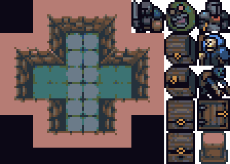
Dungeon tileset I made with my favorite palette (db-iso22). Usable for a roguelike or dungeon crawling game. Tiles are 16x16px.
Contains:
- wall and floor tiles
- 2x player character
- enemies: slime, necromancer, ghoul
- chest (closed/open) in 2 different perspectives
- trapdoor/ entrance
- column
Many thanks to:
- DawnBringer sensei for the db-iso22 palette
- Surt for creating a tileset that inspired this one
- MedicineStorm for posting Surt's cc0 scraps where it was included
- blurymind for making Tilemap editor that works
License is cc0 do whatever you like with this. If you use this I don't mind if you share a link in comments.
The demon portrait in the mockup comes from my portrait pack, if you want to use it. It uses the same color palette.
Download
Development log
- adjusted chest, new hero and enemiesDec 19, 2023

Comments
Log in with itch.io to leave a comment.
seriously man just want to drop by this random comment section and let you know you are valuable. i just went down the rabbit hole of discovering your account which led to me getting and organizing all your content and then realizing that i need all of surts content too. your work is incredible, thanks for giving me inspiration and for not abstracting your goal with a paywall on a site that's about pushing boundaries
thanks a lot scumball-san, im a massive fan of surt their pixelart is legendary, if you wanna go down some more rabbit holes strewn with free assets check out BUTTERHANDS, ansimuz, ghostpixxells, finalbossblues, Screaming Brain Studios and PiiiXL
also your nick has a strong aura to it, dont let it go to waste and make something cool
dude, i was literally searching far and wide for an asset collection like Screaming Brain Studios. I am somewhat of a digital art hoarder, so I made quick work of all those creators. Suffice to say I hold the power to create worlds. Thanks man and I'll be sure to stop by and rate pages and keep up now and again.
Looks good except one moment. You don't have much consistency between objects and evn incline. The left chest on the preview is aligned with walls so it looks normally but right chest is weird. As you didn't add incline to luke, character and column (I am not sure about the slime but looks good even with this small incline) I recommend you not to add incline to the chest.
And in general the chest have another perspective. Its Z coordinate points to viewer but other sprites have z coordinate point to up of the screen with some small angle... I like it except chest
ah you know what, you're spot on about the chest, but somehow it doesn't bother me visually? having it point up would make it more neutral for sure regardless of placement. if I come back to this tileset later for fun I might add another version of the chest :)
I agree with dustdfgs comment on the perspective. It's a freaking amazing looking chest- I love it! but for a viewer its a bit dizzying having 2 different perspectives. Probably wouldn't take much to fix- a few pixels shifted to the left and you're all good.
thanks for the feedback - i didnt want to remove the original chest sprite since i do like it, but i added an alternative chest with typical top-down perspective
also threw in some more enemies when revisiting
Looks good! I like it. Can't remember if I told you about OGA. Sorry if I did it earlier
yeah i do have some assets on there, when i'm done with this pack i'll probably upload it too
I really love the shading on the original chest, but the one you added looks great too! Thanks for incorporating some of out feedback~ YEY :D
:3